

Tento článok je dostupný len v anglickom jazyku.
Creating reusable and accessible UI components is a cornerstone of modern web development, especially in frameworks like Angular.
I invite you to explore a series of articles where we’ll build various components step by step, tackling challenges and uncovering practical solutions along the way ✨
From simple to complex
In the first article, we’ll start with the simplest component — Collapsible, whose logic boils down to animating the expansion and collapse of content. There are plenty of implementations of this component in plain JS (and, considering modern styling capabilities, even in pure CSS). However, I propose using approaches that are fully supported by major browsers at the time of writing and allow us to seamlessly integrate the implemented logic into Angular’s declarative nature.
Let’s define the requirements
Here’s what the component should be able to do:
- Expose an
[open]input to toggle the content’s expanded or collapsed state - Animate the expansion and collapsing
- Support basic accessibility features, including motion reduction for sensitive users and appropriate ARIA roles for assistive technologies
- If the content is collapsed, it should be removed from the DOM
Additionally, in line with Angular’s mechanics:
- Support both eager initialization of content (when child components are initialized but not inserted into the DOM while in the collapsed state) and lazy initialization (when the lifecycle of children is fully tied to the
[open]state)
We’ve covered the requirements, let’s move on to writing the base:
				@Component({
  selector: 'app-collapsible',
  host: {
    role: 'region',
    '[class.open]': 'open()',
  },
  template: `
    @if (open()) {
      <div class="collapsible-content">
        @if (template(); as lazy) {
          <ng-container *ngTemplateOutlet="lazy" />
        }
        <ng-content />
      </div>
    }
  `,
  styleUrl: './collapsible.scss',
  imports: [NgTemplateOutlet],
})
export class Collapsible {
  readonly open = input(false);
  readonly template = contentChild<TemplateRef<unknown>>('collapsibleContent');
}
Animation
The key feature of the component is the smooth animation. We’ll achieve this using the transition property on grid-template-rows, as animations for grid tracks (including grid-template-columns) are now supported in all major browsers. To enhance the animation’s smoothness, we can also transition the opacity property:
				:host {
  display: grid;
  grid-template-rows: 0fr;
  opacity: 0;
  transition-property: grid-template-rows, opacity;
  transition-timing-function: ease-in-out;
  transition-duration: var(--duration, 250ms);

  &.open {
    grid-template-rows: 1fr;
    opacity: 1;
  }

  @media (prefers-reduced-motion) {
    --duration: 0;
  }
}

.collapsible-content {
  // We need to constrain the size of the child to the size of the grid row
  // to ensure the height animation works correctly
  overflow: hidden;
}
Pitfalls
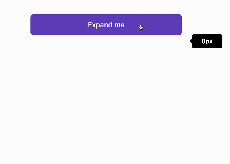
Even a simple component like this comes with its challenges. As shown in the preview below, the transition works correctly when expanding, but there’s no animation when collapsing:

This occurs because the child element is removed from the DOM before the transition completes, preventing the animation of the grid-template-rows fraction from finishing.
🚀 Let’s fix this!
Signals + RxJS
As you may have noticed in the previous code snippets, I’m using Angular’s relatively new signal-based API. However, there’s nothing stopping us from combining signals with RxJS to create a reactive flow for managing a new contentShown state (⚠️ keep in mind that at the time of writing, the RxJS Interop package is still in developer preview).
In our case, when the state open changes to false, we need to wait for the transitionend event before setting contentShown state. To achieve this, we can write a simple reactive chain by wrapping the input into a stream using toObservable:
				private readonly el = inject(ElementRef).nativeElement;

readonly contentShown = toSignal(
  toObservable(this.open).pipe(
    switchMap(open => {
      if (open) {
        return of(true);
      } else {
        return fromEvent(this.el, 'transitionend').pipe(map(() => false));
      }
    })
  )
);
Important notes:
transitionendevent bubbles, so we need to handle only the events that occur directly on the host element- In our example, the transition involves multiple properties:
grid-template-rowsandopacity. However, we are only concerned with the ending of the grid row transition
Let’s use the filter() operator to discard unnecessary emissions when the transition ends:
				fromEvent<TransitionEvent>(this.el, 'transitionend').pipe(
  filter(e => e.target === e.currentTarget && e.propertyName === 'grid-template-rows'),
  map(() => false)
)
The only thing left is to update the condition in the @if block in our template to use contentShown state instead of open, which is updated based on the transition handling:
				@Component({
  selector: 'app-collapsible',
  host: {
    role: 'region',
    '[class.open]': 'open()',
  },
  template: `
    @if (contentShown()) {
      <div class="collapsible-content">
        @if (template(); as lazy) {
          <ng-container *ngTemplateOutlet="lazy" />
        }
        <ng-content />
      </div>
    }
  `,
  styleUrl: './collapsible.scss',
  imports: [NgTemplateOutlet],
})
export class Collapsible {
  private readonly el = inject(ElementRef).nativeElement;

  readonly open = input(false);

  readonly contentShown = toSignal(
    toObservable(this.open).pipe(
      switchMap(open => {
        if (open) {
          return of(true);
        } else {
          return fromEvent(this.el, 'transitionend').pipe(
            filter(e => e.target === e.currentTarget && e.propertyName === 'grid-template-rows'),
            map(() => false)
          );
        }
      })
    )
  );

  readonly template = contentChild<TemplateRef<unknown>>('collapsibleContent');
}
That’s it! Let’s take a look at the result:
Now, the transition animation works correctly for both expanding and collapsing the content. Moreover, the content is dynamically removed from the DOM when hidden, eliminating unnecessary overhead.
How to use it?
Collapsible is an atomic component that, in most cases, will serve as a building block for more complex components such as an accordion, tree, and others. Nevertheless, we now have a lightweight component that you can easily create yourself, complete with animation, accessibility support (we recommend following Disclosure ARIA design pattern) and the ability to eagerly or lazily initialize expanding content.
Example of usage:
				<button type="button"
        [attr.aria-expanded]="open()"
        (click)="open.set(!open())">
  Trigger
</button>

<app-collapsible [open]="open()">
  <ng-template #collapsibleContent>
    Lazy content
  </ng-template>
  <!-- or -->
  Eager content
</app-collapsible>
You can explore the final result on StackBlitz:
Stay tuned for the next article, where we’ll tackle more complex components and refine our approach further!


